Martina Archetti | Character Concept Artist & Visual Storyteller
Martina Archetti
Character Design
Art Direction
Illustrations
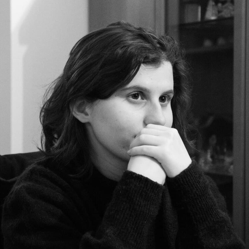
HI! I'm Martina
Character Concept Artist & Visual Storyteller. Based in Milan, Italy
I love giving stylized characters real emotional depth.Fascinated by psychology and meaningful narratives, I help game studios and authors translate complex feelings and dark themes into memorable visual design.When I’m not sketching, I’m usually dissecting atmospheric narrative games, reading books that tackle heavy themes, watching thought-provoking anime, or turning my 2D creatures into handmade crochet amigurumi.
Text
Got a project in mind?
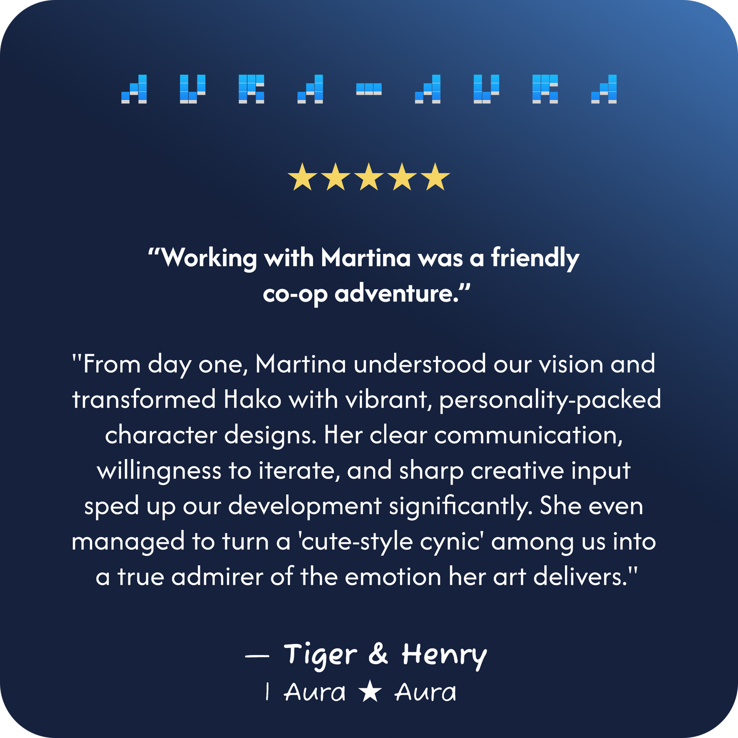
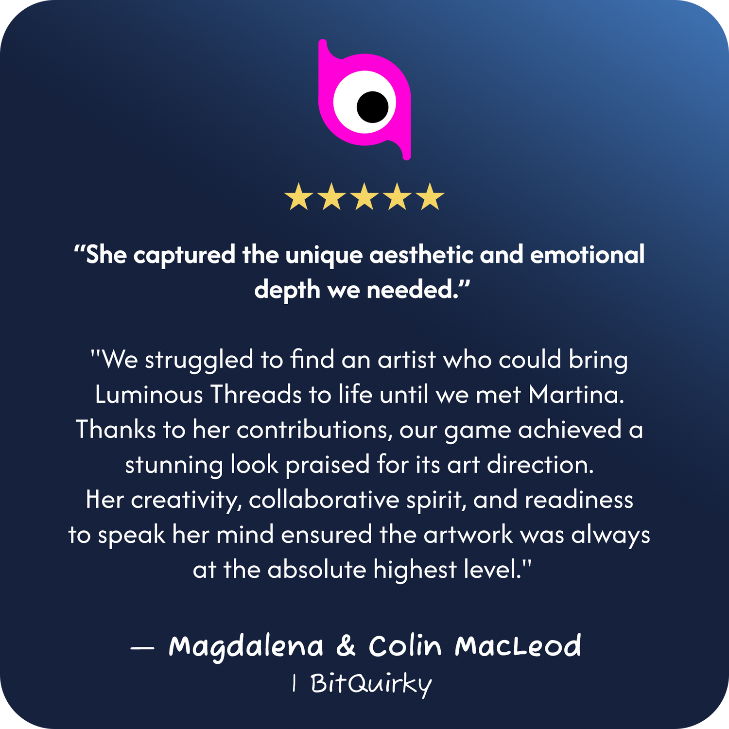
Kind Words from Clients
Working Timeline
● 2024 - Present / Lumen Studios
| Pixel Artist and UI Designer
● 2021 - Present / WhaleBrain
| Art Director
● 2024 - 2025 / Daniele Cerardi
| Character Concept Artist and Comic Book Illustrator
● 2024 - 2025 / Aura ★ Aura
| Character Concept Artist
● 2024 / Luminous Threads
| General 2D Artist and Animator 2D (Spine)
● 2023 / Project Nomad's Dream
| Concept Artist and Illustrator
● 2022 / Bloop Animation (Education)
| - Animation Foundation Certificate
| - Storyboarding Foundation Certificate
● 2022 / Gren_mp
| Illustrator
● 2020 - 2022 / Event Horizon School (Education)
- The Sinking Theater (Game Project First Year)
- Hell of a Management (Game Project Second Year)
- Rebel Robot Project (Game Project Third Year)
- Game Concept Artist Diploma
- Pixel Artist Certificate
Want to work together?
Character Design
Art Direction
Collaborations
Illustrations
You can reach me directly by email.
I Shine in Silver
I Shine in Silver · A Journey of Self-Acceptance & Diversity
Written and illustrated as an authorial picture book, this project follows Leonardo’s emotional journey toward embracing what makes him visibly different. Centered around piebaldism, the character design explores how physical diversity shapes self-esteem, family lineage, and vulnerability.

Silhouette & Garment Exploration: Tested extensive garment silhouettes, fabric drapes, and vintage tailoring iterations to define character hierarchy, era, and personality before locking final lineart.
Lighting & Surface Render Studies: Conducted sequential rendering passes, calibrating soft skin diffuse, hair volume, and painterly edge control to establish a warm, tactile visual benchmark for the book.
Production Model Sheets & Colorways: Developed comprehensive character sheets featuring orthographic turnarounds, multi-palette color testing, and nuanced emotional acting designed for narrative storybook pacing.


The Masked Tea Spirits (Harvest, Sowing, Combine)
The Tea Keepers · Botanical Folklore & Agricultural Stages
A trio of nomadic woodland spirits, each embodying a key phase of the tea cultivation cycle: Sowing (seeding), Harvesting, and Processing (brewing):

Functional Agricultural Props: Each spirit carries the tools of their craft—the ceramic teapot used to gently water and nurture young tea shoots (Sowing), the curved harvesting sickle (Harvest), and the embroidered herbal sack used for blending artisanal tea leaves (Combine).
Porcelain Masks: Traditional oval masks featuring asymmetrical perforations, giving them an enigmatic, ancient forest-spirit presence.
Seasonal Chromatic Iterations: Quilted capelet variations tested across botanical palettes to evoke fresh tea leaves, blooming camellia flowers, and rich roasted infusions.


Action RPG Roster: Combat & Narrative Psychology
Dynamic Equilibrium, Combat Posing & Character Lore
A character roster designed for stylized narrative action, focusing on intense physical acting and narrative transformation:

Steiner the Brawler (Combat Posing & Equilibrium): Weight, kinetic flow, and balance studies tested across 9 dynamic hand-to-hand martial arts poses, focusing on grounded stances, high kicks, and defensive guard transitions. Supported by tactical wraps and utility harness variations.
Sera the Scientist (The Duality of Memory Loss): Designed around the jarring contrast of a life fractured by amnesia, balancing her methodical, clinical researcher identity with a disoriented, casual everyday self.


Storybook Character: The Boy in Blue
Visual Metaphor Through Form: From Softness to Geometry
Developed for an illustrated narrative, this project explores the bittersweet transition from childhood wonder to adult disillusionment. To reflect this emotional arc, the visual style itself transforms throughout the story, gradually shifting from organic, rounded curves to rigid, angular geometry.

Shape Language Evolution (Child vs. Adult): Designed a deliberate contrast between life stages: little Gino is built with soft, buoyant circles and puffed sleeves representing carefree freedom, while his adult design shifts into sharp, elongated, geometric angles symbolizing structure and emotional restraint.
Attire Research: The Kindergarten Smock: Grounded the boy's costume in traditional childhood nursery smocks, featuring billowy sleeves, protective collars, and the iconic identifying pin. Conducted 6 design explorations to balance nostalgic schoolwear references with playful character individuality.
Model Sheet & Textured Emotional Acting: Developed a complete production sheet combining traditional-feel chalk textures with an 8-expression facial library, capturing raw, unfiltered childhood reactions ranging from pure laughter to inconsolable tears.



Art Director | Apr 2021 – Present
Tools: Photoshop, Illustrator, Affinity Publisher, DaVinci Resolve, WordPress
Brand Identity & Art Direction: Established the complete visual identity, logo, and stylistic guidelines for the school from the ground up.
Illustration & Marketing Assets: Created all visual content for courses, newsletters, website assets, and YouTube thumbnails.
Web Design: Designed and developed the official website and landing pages in WordPress.
Character Concept Artist & 2D Animator | Jan 2024 – Aug 2024
Tools: Photoshop, Spine 2D
Visual Development & Concept Art: Defined the game's overall art direction, character concepts, and storyboards to align the team.
2D Animation (Spine): Rigged and animated every character’s idle loop, so they feel alive even when standing still.
Narrative & UI Design: Drew the comic-style cutscenes, promotional illustrations and in-game UI.
Pixel Artist & UI Designer | Jan 2024 – Present
Tools: Aseprite, Photoshop
Character Portraits & Expressions: Crafted 7 distinct character portraits with full emotional expression sheets for dialogue systems.
Environment & Visual Mockups: Designed pixel art background environments and full in-game view mockups.
Game UI: Created themed pixel art user interface assets and menus.
WhaleBrain
Art Direction & Brand Identity · 2021 – Present
WhaleBrain is an educational platform teaching deep, systemic game design to indie developers.
As Art Director from day one, I established the company’s entire visual language from scratch, translating abstract game theory into an engaging, cohesive brand ecosystem.
01. Brand & Sub-Brand Identity
At WhaleBrain, education centers on "Deep Thinking", a systemic approach that sets the academy apart in the game design space. The brand identity is built on a central philosophical metaphor: Game design is like water. You cannot shape water directly (the player's emotional experience); you must sculpt the container that holds it (the game's systems and rules). Every visual element stems from this aquatic duality.

Diving into the Mind (WhaleBrain Core Logo)
The Downward Spiral: The silhouette of a whale descends into the abyss, wrapping around the brain to symbolize exploring the deepest layers of game design theory.
The Dual Symbol: The whale represents the depth, while the brain represents sharp, strategic thinking.
Color Palette: It echoes the brand's two main colors, navy blue and white

From Rigid Logic to Organic Foundation (CoralCore Sub-Brand)
CoralCore is WhaleBrain's masterclass teaching developers to architect solid gameplay frameworks before opening the engine, eliminating the costly trial-and-error cycle common in indie dev.
The Hexagon (Structure & Logic): A geometric shape representing rules, architecture and systems thinking.
The Branching Coral (Foundation): Just as coral forms the organic bedrock of the seabed, the geometric edge transitions into living coral branches, symbolizing how a structured mind nurtures creative life.
The Pearl ("The Core"): Nestled at the center, the pearl represents the gameplay as the core of game design
02. Mascot Design: From Ideation to Final Design

The Concept Pipeline: Finding the Mentor
Creating Kaptain Haven, the academy’s lead host and founder avatar, required balancing authoritative expertise with an inviting, relatable demeanor.
Silhouette & Proportions: Explored a wide anatomical spectrum, transitioning from everyday casual proportions to a grounded, heroic build that communicates energy and leadership.
Facial & Beard Iterations: Systematically tested hair styles, jawlines, and facial trims to establish an expressive, mature yet warm character face.
Text
Aesthetic Fusion: Oceanic x Solarpunk Tech
WhaleBrain’s world bridges marine biology with futuristic technology:
Apparel Variations: Designed multiple iterations of the custom tracksuit, experimenting with logo hierarchies, seam placements, and functional graphic accents.
Fluid Water-Lines: A signature visual language of dynamic white vector ribbons cutting through deep ocean blues to depict current and thought flow.
Solarpunk & Neon Accents: Hexagonal shoulder pads and glowing neon circuitry, grounding the brand in progressive, forward-thinking tech education.


Roster Consistency & Functional Roles
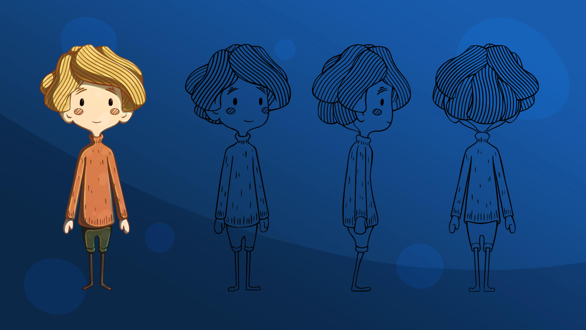
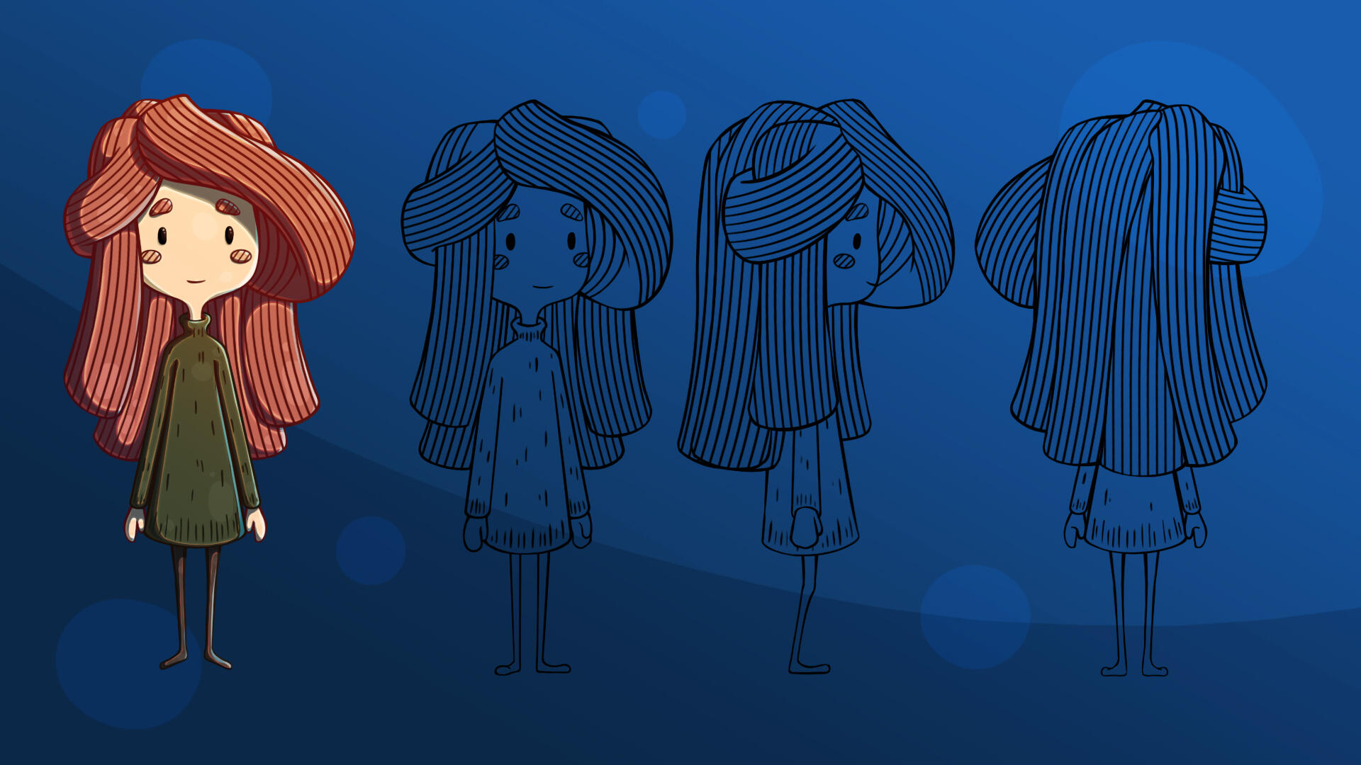
Beyond the main mascot, I expanded the cast to visually categorize WhaleBrain's educational branches. Characters like Neel and Narelle were developed to ensure stylistic harmony across the platform:
Subject-Matter Mentors: Each secondary character is paired with a specific design branch. For instance, Neel consistently guides students through the Gameplay Design modules, acting as a visual cue across targeted articles and course infographics.
Stylistic Unity: Maintained rigorous consistency in line weight and cell-shading style, proving the aesthetic can scale seamlessly across multiple characters.
Text
03. Purpose-Driven Illustration & Composition
Visual Direction Tailored to Commercial Intent
An illustration’s composition must serve its specific context. Across WhaleBrain’s platform, I established three distinct visual frameworks, each engineered with a specific goal, audience mindset, and cognitive load in mind:

1. Editorial & Long-Form Essays (Blog Articles)
Visual Metaphors for Abstract TheoryEditorial art accompanies dense, academic game design essays. The focus is on contemplative storytelling rather than aggressive marketing.
Narrative Metaphors: Translates complex theory into tangible situations such as students examining game case studies, exploring oceanic caves, or dismantling rigid industry dogmas.
Ensemble Storytelling: Utilizes the secondary character roster to act out human dynamics (curiosity, debate, study), making deep game design theory feel relatable and welcoming.
2. Course Product Covers (Masterclasses)
Architectural Systems & Perceived ValueMasterclass covers serve as digital packaging for premium educational products. They must communicate structure, complexity, and high production value.
Diagrammatic & Sci-Fi Frameworks: Blends marine aesthetics with telemetry and systemic interfaces such as submarine sonars, neural constellations, and interactive hardware consoles to visualize intangible mental models.
Integrated Typographic Hierarchy: Composed specifically to support multi-line course titles, subtitles, and branding without fighting the underlying illustration.
Systemic Depth: Communicates the multi-week scope of the course at a glance, reassuring prospective students that they are investing in a structured, professional framework.


3. Marketing & YouTube Thumbnails (High-CTR Video Assets)
Engineered for Scroll-Stopping Emotional ConflictOn public video feeds, the artwork has less than a second to capture attention and must remain legible even at tiny smartphone resolutions.
Developer Pain Points: Taps directly into the visceral struggles of game development expressed through intense, theatrical character acting.
Micro-Scale Visual Hierarchy: Crisp, bold silhouettes cleanly detached from glowing backgrounds, ensuring immediate readability on mobile screens.
High-Contrast Chromatic Strategy: Electric navy blues contrasted by fiery warning reds, energetic yellows, and glowing neon whites to maximize Click-Through Rate (CTR).
Text
04. Educational Systems: Studio Set & Info Graphics
Educational design must bridge the digital and the real world. To create an immersive learning environment for WhaleBrain's masterclasses, I oversaw both the physical set direction and the digital instructional materials:
Studio Set Direction & Real-Life Inspiration:
I curated the aesthetic of the recording studio, aligning ambient oceanic lighting, prop placement, and physical brand elements (framed logo on the set wall).Crucially, the founder’s real-world persona and mannerisms (such as his signature direct-to-camera gestures) served as the direct anatomical reference for Kaptain Haven, making the mascot an authentic digital extension of the instructor.


Infographics & Slides
Educational decks in game design often suffer from text-heavy slides or dry, disorienting diagrams. For WhaleBrain’s curriculum, I developed a structured visual language designed to maximize student comprehension and retention across dozens of hours of lectures:
Cognitive Structuring & Mental Models: Transformed complex, multi-layered game mechanics (progression loops, player psychology, system architecture) into clean diagrams, metric scales, and intuitive flowcharts that break down theories into clear, step-by-step logic.
Pedagogical Illustration & Reference: Grounded abstract game design principles through custom spot illustrations, recognizable industry tropes, and visual analogies, ensuring theoretical concepts immediately connect to practical development realities.
Modular Slide Hierarchy: Designed branded presentation templates featuring consistent container UI, readable typography hierarchies, and thematic framing that eliminate visual fatigue during long, technical lectures.
05. Web Experience & Digital Ecosystem

Bringing the Brand to Life on the Live Platform
An art direction system is only as strong as its real-world implementation. To ensure the brand’s identity translated seamlessly into the digital product, I designed the visual layout and custom assets for the official WordPress platform:
Immersive Web Storytelling: Integrated hero illustrations, custom section dividers, and the abyssal color palette into the website’s architecture, creating a welcoming, atmospheric portal for aspiring game developers.
Cross-Platform Consistency: Extended the aesthetic into a cohesive digital ecosystem from marketing landing pages and newsletter headers to YouTube channel branding and community platforms, ensuring a unified student journey from discovery to enrollment.
Luminous Threads
Character Concept Art, 2D Animation (Spine) & UI · 2024
Luminous Threads is a cyberpunk psychological visual novel developed by Scottish indie studio BitQuirky. As lead 2D artist, I established the game's dark, neon-soaked visual identity from scratch, designing the entire character roster, rigging skeletal 2D animations in Spine, and crafting the narrative UI and cinematic storyboards.
Official Announce Trailer
01. Art Direction & Stylistic Foundations

Fusing Comic Inking with Cyberpunk TechwearTo capture the game's psychological tension, I created a moodboard inspired by modern narrative classics (such as Hades and Persona 5):
Halftone & Comic-Book Shading: Integrated screen-tone dots, cross-hatching, and crisp black ink shadows to give the visual novel a distinct graphic-novel texture.
High-Contrast Neon Palette: Saturated magentas, electric cyans, and warm amber accents sharply contrasted against deep urban blacks.
Functional Techwear Costuming: Grounded character fashion in modern streetwear, asymmetrical coats, and technical cyber-gear.
02. Character Concept Art & Production Model Sheets

Designing Archetypes for Skeletal RiggingCharacters in Luminous Threads represent diverse factions within a stratified cyberpunk society, from street-level hackers and corporate elites to institutional inmates.
Production-Ready Model Sheets: Illustrated clean, detailed front and 3/4 views for each character (such as protagonist Juno Onishi), engineered specifically with clean layer separation to facilitate mesh slicing and bone rigging in Spine 2D.


Extensive Palette & Costume Testing: Conducted in-depth color exploration across multiple iterations to balance high-visibility neon accents, faction symbolism, and readability against dark backgrounds.
Distinct Faction Language: Differentiated the roster through silhouette and fabric textures, contrasting casual oversized techwear with sharp corporate suits and institutional uniforms.
03. 2D Skeletal Animation (Spine 2D)

Bringing 2D Illustrations to LifeVisual novels often rely on static sprites. To elevate production value, I cut, layered, and rigged character meshes in Spine 2D for Unity:
Fluid Idle & Breathing Cycles: Animated subtle breathing, hair physics, and blinking to create a lifelike, breathing presence during dialogue scenes.
Environmental Variations: Developed alternate animation states (including wet/rain-soaked mesh variations) to seamlessly reflect in-game atmospheric shifts.
Optimized Unity Export: Prepared JSON/atlas exports and bone hierarchies optimized for fast rendering and smooth engine transitions.
04. Cinematic Storyboarding & Cutscenes

Visual Pacing and Dramatic SuspenseKey narrative turning points were directed through dynamic storyboard sequences and animatics:
Cinematic Framing: Composed production storyboards, cinematics, and final boards focusing on tension, abrupt camera angles, and dramatic lighting to heighten suspense during action beats.
Team Alignment: Provided clear visual pacing guides for the development team to coordinate audio cues, screen shakes, and text transitions.


05. In-Game UI & Dialogue System Design
Designing Context-Driven Interfaces for Narrative FlowIn a visual novel, text is the core gameplay loop. My task was to design the graphical framework for the game's dialogue system, tailoring the interface to distinct narrative voices while establishing optimal screen real estate:
Narrative Dialogue States: Designed distinct visual frames reflecting different narrative states, differentiating active spoken dialogue, Juno’s internal monologues, omniscient narration, and branching choice prompts.
Screen Layout & Mockups: Built full-screen interface mockups to test layout balance, font sizing, and safe margins, ensuring the dialogue boxes occupied the ideal screen percentage without crowding character sprites.


Lumen Studios (Pixel Art Project)
Pixel Artist & UI Designer · 2024 – Present
[ ● In Active Development ]
Currently in development with Lumen Studios, this unannounced title is a narrative-driven survival RPG. As the lead pixel artist and UI designer, I am responsible for establishing the visual world from the ground up, creating expressive character dialogue portraits, modular winter environments, animated isometric sprites, item iconography, and in-game interface mockups.
01. Character Portraits & Emotional States

High-Fidelity Pixel Character ActingIn narrative RPGs, dialogue portraits carry the weight of player empathy. Using Aseprite, I designed high-resolution pixel art busts engineered for nuanced storytelling:
Micro & Extreme Emotion States: Developed a multi-tiered expression system, ranging from subtle neutral and sad states to intense reactions to support branching narrative consequences.
Palette Cohesion & Shading: Applied controlled color ramps and directional lighting on hair, skin, and fabric to maintain a painterly, organic look without visual noise.

02. Environmental Pixel Art & Temperature States


Atmospheric, Layered Wilderness
Designed the core campsite environment as a modular, atmospheric hub where characters gather:
Layered Depth & Parallax: Structured foreground pine trees, midground campsite clearings, and background birch forests to create depth across widescreen displays.
Dynamic Weather & Snow States: Illustrated environmental variations to visually communicate temperature drops and time progression.
Text
03. In-Game Sprites & Frame-by-Frame Animation

Bringing the Camp to LifeGrounding characters in the isometric gameplay space through detailed prop interactions and frame-by-frame FX:
Seated Character Sprites: Illustrated custom isometric character sprites interacting with environmental objects
Animated Campfire FX: Hand-crafted fluid, frame-by-frame fire animations and rising embers in Aseprite to serve as the warm, pulsing focal point of the campsite.
04. Item Iconography & Survival Resources

Pixel-Perfect Readability at Small ScalesSurvival mechanics depend on instant inventory recognition. I crafted distinct resource icons optimized for quick cognitive processing:
Silhouette Clarity: Designed food, fuel (wood, coal), and crafting materials with bold, readable outlines and tactile textures.
Progressive Status Icons: Illustrated multi-stage items, such as the thermometer measuring freezing-to-warm temperature states, providing clear diegetic telemetry for the player.
Text
05. Full Gameplay Mockup & UI Integration

Harmonizing Pixel Art with Modern UITo test overall gameplay composition, I built full 1920x1080 mockups combining environmental art with functional survival UI:
Tactical UI Layout: Structured dark, translucent containers for Day Recap statistics, dialogue choices, and action menus that preserve immersion without blocking the pixel scene.
Visual Hierarchy: Balanced sprite placement, active character focus, and text containers to ensure clarity during critical narrative decisions.


